Flo has 380 million downloads. We studied their onboarding to find out what's actually driving that number.

Flo exists to make reproductive health less confusing, less isolating, and more accessible to hundreds of millions of people. We didn't pick them because they're big. We picked them because they're purpose-led and they're winning. That combination is rare.
Activate new users in the first 7 days
Find the triggers that convert free into paid
Prevent churn with behaviour-based retention
Turning Privacy Into a Growth Lever
Privacy is top of mind. For everyone.
Data breaches, tracking scandals, regulatory crackdowns. Every user downloading a health app in 2026 arrives with their guard up. They're sceptical before they even open your app.
Flo doesn't run from this. They lean into it. Their first screens don't feel like a legal checkbox. They feel like a handshake. By the time you're asked for health data, you already trust them. Entirely by design.
Leads with privacy-first messaging, human tone, and visual safety cues across the first 3 screens. Turns a legal requirement into an emotional trust moment.
"Your data is protected" before any ask
Shield icons, locks, calming colours
Screen
Legalese rewritten to feel like a chat
2-3 light screens, not one dense wall
The first piece of information we encounter carries disproportionate weight. It becomes the lens through which we interpret everything that follows. In psychology, this is why first impressions are so hard to override — our brains anchor to whatever comes first.
Flo's first 3 screens aren't about features, onboarding, or data collection. They're about safety. "Your data is protected" appears before a single personal question. By leading with trust, every screen that follows inherits that feeling. The entire flow feels safer because the opening said so.
Privacy positioning — "Your data is safe" before a single personal question
Visual safety signals — Shield icons and soft palettes do the heavy lifting
Progressive disclosure — Legal info in bite-sized steps, not one dense wall
Emotional transfer — Trust built here carries forward through the entire flow
Compliance or trust promise? High drop-off here = trust problem, not a UX one.
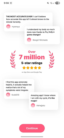
Social Proof That Creates Belonging
Nobody cares how many downloads you have.
"Join 10 million users" sounds great in a pitch deck. In an app? Means nothing. What every new user actually wants to know: "Is this for someone like me?"
Flo gets this. Their social proof doesn't flex numbers. It says "people with your condition found this helpful." That's the difference between bragging and making someone feel seen.
Uses identification-based testimonials and community stats early in the flow. Framed around "people like you," not download counts.
"People like you" not "millions of users"
Before any personal data is requested
"I'm in the right place" energy
Not repeated until it feels like marketing
When people are uncertain, they look to others to decide what to do. It's why we check reviews before buying, why we pick the busy restaurant over the empty one. The behaviour of people around us becomes a shortcut for our own decision-making.
Flo doesn't flex download numbers. Instead, they show testimonials framed around "people with your condition found this helpful." It's not social proof that says "we're popular." It's social proof that says "you belong here." Placed before sensitive data requests to lower sharing anxiety.
Identification framing — "Women with your condition" beats "380M downloads"
Story over stats — User stories create connection. Numbers create distance.
Strategic timing — Placed before sensitive data requests to lower anxiety
One and done — Front-load your best proof, then let the product speak
Swap "10M downloads" for "people like you found this helpful." Identity beats numbers.
Data Entry as Emotional Investment
Nobody walks away from something they spent 10 minutes building.
Most onboarding treats data collection like a form at the doctor's office. Fill it in, hit next, let's go. Flo treats it like you're building something together.
Every input makes the product feel more personalised, more "theirs." By the time someone has answered 30 questions, they haven't just set up an app. They've invested in it. Walking away? Feels like throwing away something you built with your own hands.
Turns data collection into a personalisation journey with progress bars, quick wins, and visible payoffs. Setup becomes ownership.
Selection
Length
Tracking
Result
People place disproportionately high value on things they helped create — even if the result is objectively worse than a ready-made alternative. It's why flat-pack furniture feels more "yours" than something delivered pre-assembled. Effort creates attachment.
Every answer during onboarding makes the app feel more personalised, more "theirs." By the time someone has completed 30+ questions, they haven't just set up an app. They've built something. Walking away feels like throwing away work they did with their own hands.
Quick wins first — Easy questions early build momentum before harder stuff
Progress bars — Visual progress makes effort feel tangible and rewarding
Personalisation previews — Show how data shapes the experience mid-flow
Milestone moments — Celebrate completed sections. Keep the dopamine flowing.
"Tell us about yourself" → "Let's build your plan." Add progress bars. Show value before you ask for payment.
Killing Survey Fatigue
Same button 30 times = death.
Question, answer, next. Question, answer, next. Ten screens in and it's a survey. Twenty screens in and users are gone. Flo avoids this entirely.
They alternate between multiple choice, toggles, sliders, visual layouts, and progress milestones. No two consecutive screens feel the same. That variety is the single biggest reason a 50-screen onboarding doesn't bleed users.
Mixes interaction formats throughout the entire flow. Toggles, sliders, visuals, MC, progress milestones. Feels like a conversation, not a form.
MC, toggles, sliders, visuals in one flow
Tapping, sliding, selecting. Hands stay engaged.
Format
Screen
Progress milestones break up the grind
Talking, not form-filling
When we encounter the same stimulus repeatedly, we stop noticing it. It's why you tune out a ticking clock after a few minutes, or stop reading cookie banners. The brain conserves energy by ignoring anything that doesn't change.
Flo never lets two consecutive screens feel the same. They alternate between toggles, sliders, multiple choice, visual layouts, and progress milestones. The constant format switching prevents autopilot tapping — every screen demands fresh attention.
The 2-screen rule — Never the same format more than twice in a row
Visual breaks — Illustrations and celebrations between question blocks
Mixed inputs — Toggles, sliders, taps, swipes. Different actions = engagement.
Preview moments — A taste of value mid-flow to reward the effort so far
List every screen and its format. Same thing 3 times in a row? That's where users zone out.
Long Onboarding That Converts
Length isn't the problem. Boredom is.
Common wisdom says onboarding should be short. Get users in fast. Reduce friction. Flo breaks that rule completely.
50+ screens. And it works. Every screen completed is another micro-commitment. Every minute spent is another reason to see it through. By the time the paywall appears, leaving feels like wasting everything you've put in.
But length alone isn't the strategy. Flo gets away with it because every screen earns the right to exist. Long and boring will kill you faster than short and shallow.
Uses deliberately long onboarding to build investment and sunk cost before the paywall. Every screen is engaging, varied, and purposeful.
People accelerate their effort as they get closer to a goal. It's why loyalty cards with 2 stamps already filled get completed faster than empty ones. The closer the finish line appears, the harder we push to reach it.
Flo shows progress bars throughout the entire onboarding flow. As users approach the end, completion rates spike — they can see the finish line and won't quit with 80% done. Combined with 50+ screens of sunk investment, the paywall arrives at peak commitment.
Justify every screen — Doesn't build trust, collect data, or deliver value? Cut it.
Progress architecture — Show users where they are so length feels manageable
Value before paywall — A preview insight or result before asking for payment
Front-load engagement — Most engaging screens first, when motivation is highest
Early drop-off = weak opening. Middle = fatigue. Before the paywall = not enough value yet.
Small Yeses, Big Conversions
They've said yes 30 times before seeing the paywall.
Yes to sharing cycle data. Yes to picking symptoms. Yes to goals. Yes to notifications. Each one is tiny. Barely noticeable. But they stack.
By the time the subscription offer appears, paying doesn't feel like a sell. It feels like the obvious next step in a pattern they've been following for 10 minutes. That's behavioural design doing exactly what it's supposed to do.
Builds a ladder of micro-commitments from easy toggles to notification opt-ins before the payment ask. Creates a yes pattern that makes conversion feel natural.
Tiny yeses that feel effortless
Toggles and prefs before payment
Ladder
Each ask slightly bigger than the last
Payment = next step, not a cold sell
Agreeing to a small request makes people significantly more likely to agree to a larger one later. It works because each "yes" subtly shifts how we see ourselves — from bystander to participant. Once you've started saying yes, consistency takes over.
By the time the paywall appears, users have said yes 30+ times. Yes to sharing cycle data, yes to picking symptoms, yes to goals, yes to notifications. Each one tiny. Barely noticeable. But they stack. Payment doesn't feel like a sell — it feels like the next step in a pattern.
Start invisible — First yeses so easy nobody notices they're agreeing
Smooth the curve — No jumps from "pick a colour" to "enter your credit card"
Notification bridge — Push opt-in is the perfect mid-level commitment
Feature unlocking — Let users touch features before paying for access
List each agreement between app open and payment. If there's a sudden jump, that's where you lose people.
Scarcity That Doesn't Feel Desperate
Urgency works. But only if you've earned it.
Flo uses timed trial offers after the full onboarding investment. Countdown timers, limited pricing, the whole toolkit. And it works. But only because of everything that came before it.
The user has spent 10+ minutes sharing personal health data. They've watched the app adapt to them. They've built something. The scarcity offer doesn't feel like pressure. It feels like a reward for the time they've put in.
Most apps skip straight to the countdown timer on screen 3. That doesn't create urgency. It creates the back button.
Places timed offers only after significant user investment. Frames urgency as a reward, not a pressure tactic. Personalises timing based on engagement signals.
Countdown after commitment, not before
Feels like a deal, not a trap
Screen
Based on engagement, not a calendar
Urgency earned, never forced
The pain of losing something is roughly twice as powerful as the pleasure of gaining it. It's why free trials convert so well — once you've experienced the product, going back to life without it feels like a loss, not just a missed opportunity.
Flo places timed offers only after significant user investment. The user has spent 10+ minutes sharing personal health data and watched the app adapt to them. The countdown timer doesn't feel like pressure — it feels like a reward about to expire. Urgency works because they've earned the right to use it.
Earn before you ask — Deliver real value before urgency-based pricing
Personalise the trigger — Timing based on engagement, not a blanket countdown
Frame as reward — "Special offer for completing your profile" not "Act now"
Preserve the exit — Clear, guilt-free decline. Forced urgency always backfires.
If users hit the paywall before they've seen real value, you're selling a promise. Move it after their first personalised result.
Privacy screens are a trust opportunity, not a speed bump
Social proof creates belonging. Use it once, make it count.
Data entry is emotional investment. Reframe it that way.
Varied formats prevent fatigue. Same button 30 times = death.
Long onboarding converts. Boring onboarding doesn't.
Small yeses build momentum toward the big ask.
Earn the right to use urgency. Then personalise it.

Growth For Purpose
Fractional growth for purpose-led apps and products.
We use behavioural psychology and habit-change science to find and fix the growth leaks hiding in your onboarding, retention, and monetisation flows. We've worked with 25+ health, wellness, and impact apps across Australia, the UK, and the US.
Full-funnel teardowns of your onboarding, activation, and paywall flows
Psychology-backed frameworks applied to your product and user journey
Data-led experimentation to reduce churn and increase LTV
Embedded growth expertise without the full-time hire