
Redesigning Sleep for New Families
Helping parents all over Australia provide sleep & settling tracking, training & tools for parents of newborns through to 3 years.

“Working with the Growth For Purpose design team was one of the smoothest and most productive creative processes we’ve ever experienced. They truly understood the emotional journey of our users and translated it into thoughtful, high-performing UI/UX that elevated every stage of our onboarding and in-app experience.
From wireframes to final assets, their speed, attention to detail, and ability to balance brand, function and testing logic was exceptional. We tested a wide range of onboarding and paywall variants—animated, emotive, science-based, and social proof led—and the quality and polish across every asset was consistently top-tier. Feedback rounds were minimal, and every comment was actioned with care and speed.
It’s rare to find a team that can work this fast without compromising on strategic depth or execution quality. We’ve had
huge wins in conversion and engagement, and the design work was a core part of that success.”
- Daniel Platt, CTO

SleepWellBaby App
Client
Year
2024
Background
SleepWellBaby is an app designed to help parents improve their baby’s sleep and overall well-being through age-specific tips, tracking tools, and expert advice. After seeing success in Australia, SWB aimed to expand into the US market. Their core challenge was scaling efficiently in a highly competitive environment, while reducing customer acquisition costs and driving strong app retention rates
Key Goals
- Improve conversion and retention rates through user-centered design tailored to our target audience
- Deliver a seamless and intuitive experience through key app screens (onboarding, welcome, payment and paywell)
Our Role
We
redesigned SleepWellBaby’s
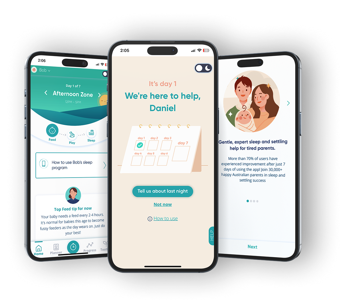
core app screens (onboarding, welcome, paywall, and payment flows) - with a focus on clarity, emotional resonance, and conversion. Using a structured A/B testing approach, we validated design decisions through real user data and iterated to improve performance. All work was aligned with the existing brand and design system to ensure a consistent, trustworthy experience.
TARGET AUDIENCE
Designing for New Parents
SleepWellBaby aims to help parents from all around the world with any struggles they may have with their babies sleep and settling routine. The app offers instant support with just a click away. Our main goal with SWB was to increase conversion, engagement and retention of new paying subscribers through delivering generous value via various CEA channels. Through doing these, we can reach more parents.
A/B TESTING
Testing the Way to Success
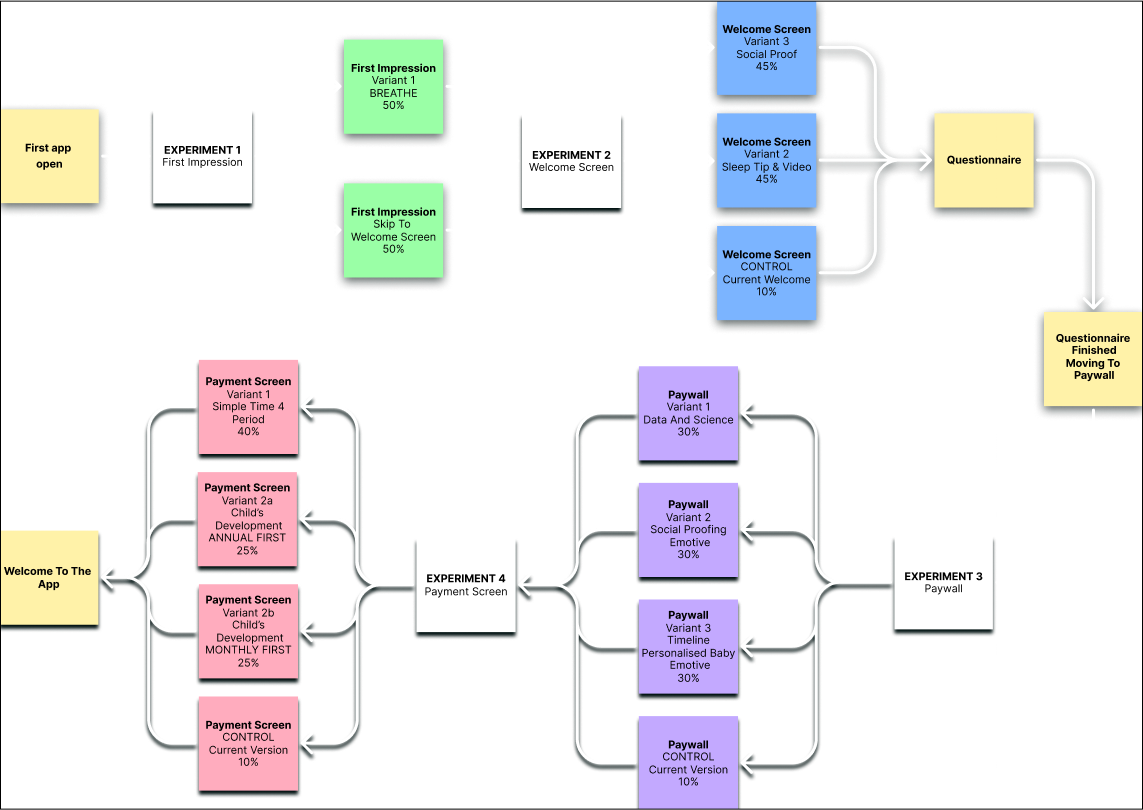
Goal: Increase conversion and retention rates through each different page variants.
We created multiple different variants for each stage of the onboarding process, experimenting with four main parts of the onboarding; first impression, welcome screen, paywall and the payment screen. The diagram below displays the A/B testing splits that we implemented.
FIRST IMPRESSIONS
From the Start
Goal: To create a positive, memorable, and engaging initial experience that makes the user want to explore further.
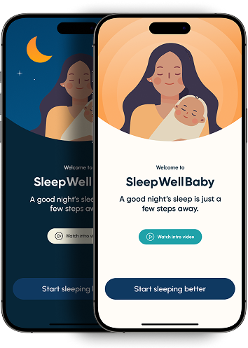
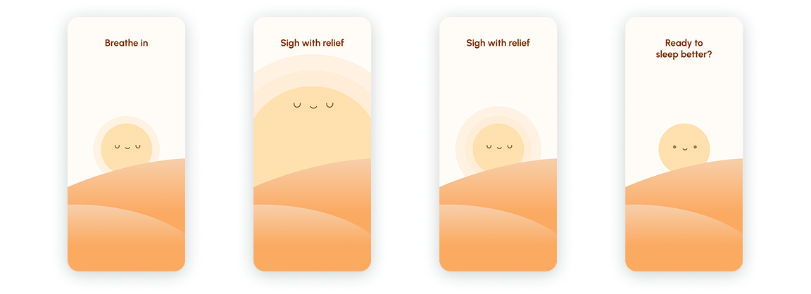
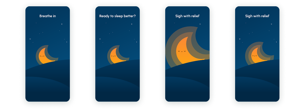
We created three different designs for the first impression both with a light and dark mode. A good first impression is an important gateway to the onboarding screen.

Design Variants
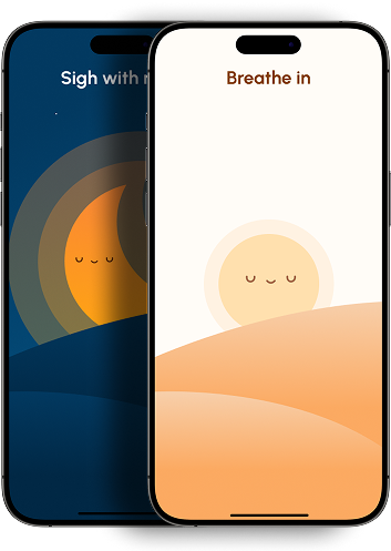
The design above introduces a Calm style breathing animation as a way to ease the user into the app through minimalism and cognitive ease.
The design uses an introductory video and anticipation to spark curiosity and motivate the user to take action.
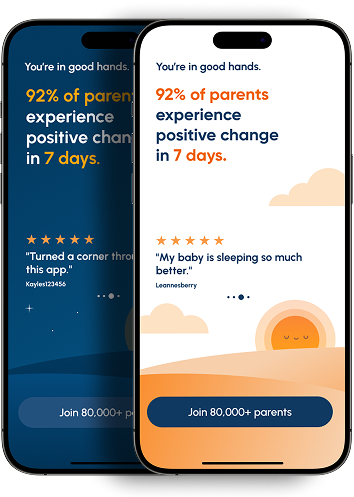
The use of social proof in this design shows that majority of similar users (parents) saw success, which reduces hesitation. The specific number (92%) gives a sense of credibility and empirical support.
Designing First Impressions for Immediate Impact
Three Ways to Paywall
PAYWALL
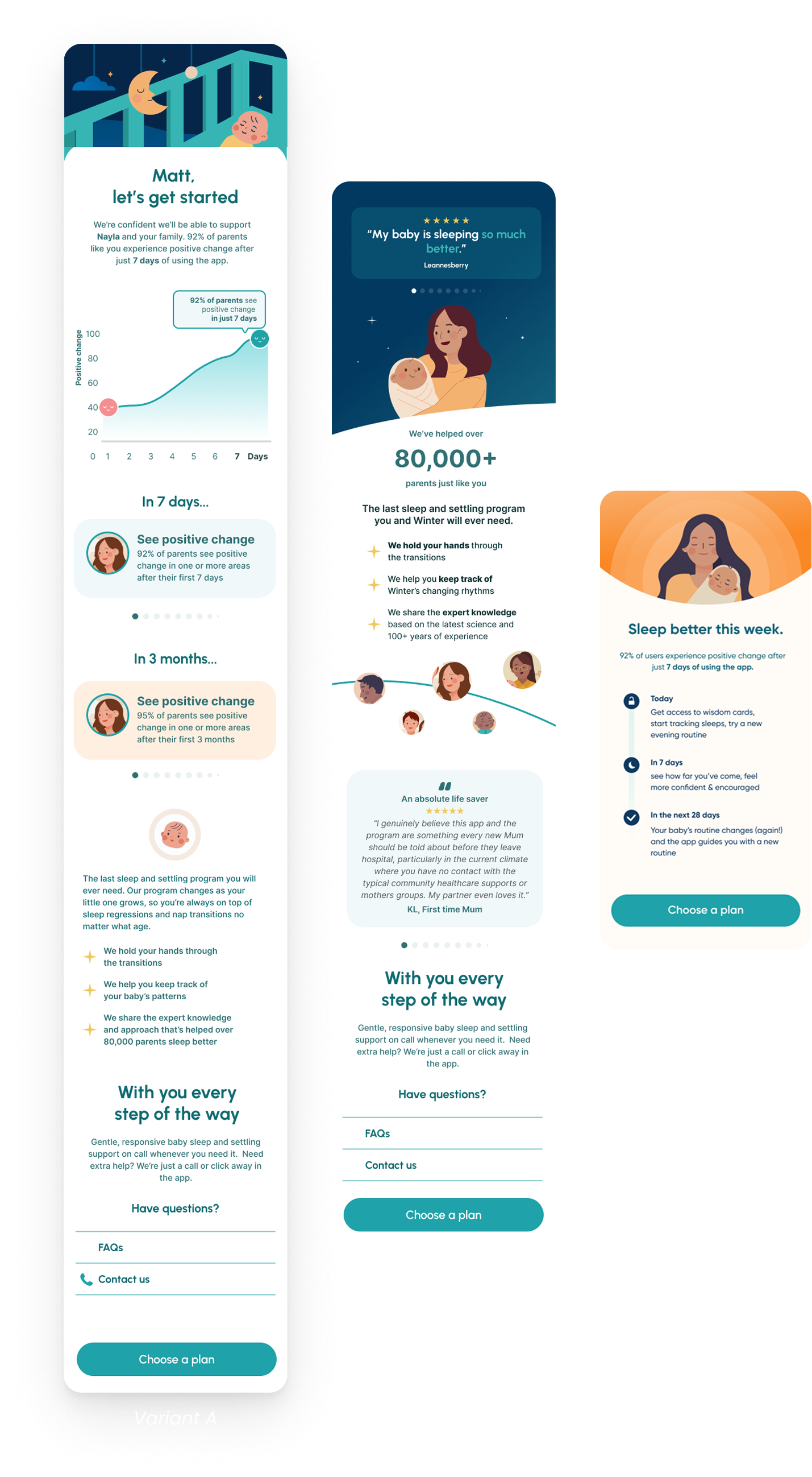
Data & Science (Variant A)
Variant A displays a design based on data and science for the paywall. Users who are prefer a more factual way of displaying data and information may be more inclined to proceed with paying for the app if they see this design.
Social Proofing Emotive (Variant B)
Social proofing is used in the design of Variant B and can also be an effective way to encourage users to proceed to paying. This design displays testimonials and from other parents and users of the app, thus creating trust with potential new users. It also taps into the emotions of people and this fosters connection.
Timeline of Sleep Improvement (Variant C)
This design shows the timeline of sleep improvement. This simplified design reduces the cognitive load. Compared to the other designs it is less text heavy and therefore may be easier to understand.
PAYWALL
Choosing A Plan
We designed three different ways to choose a plan.
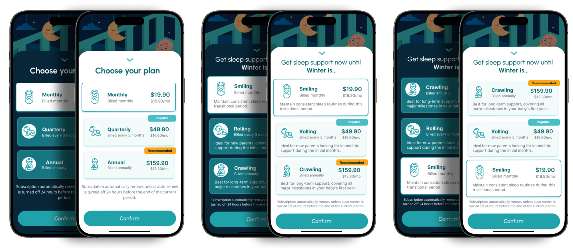
The description is simplified in the design above, reducing cognitive load.
In the design above, the child’s development is included in the description so parents can make a more informed decision basing it off their child’s development.
The design above includes a description of the child’s development but the annual billing is on top. By putting the highest-value plan first, users are mentally anchored to a high price, making the cheaper ones seem like “deals.”
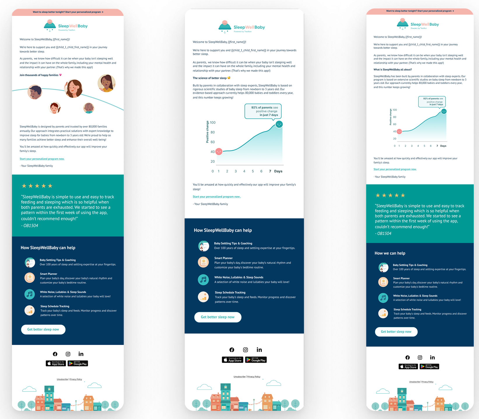
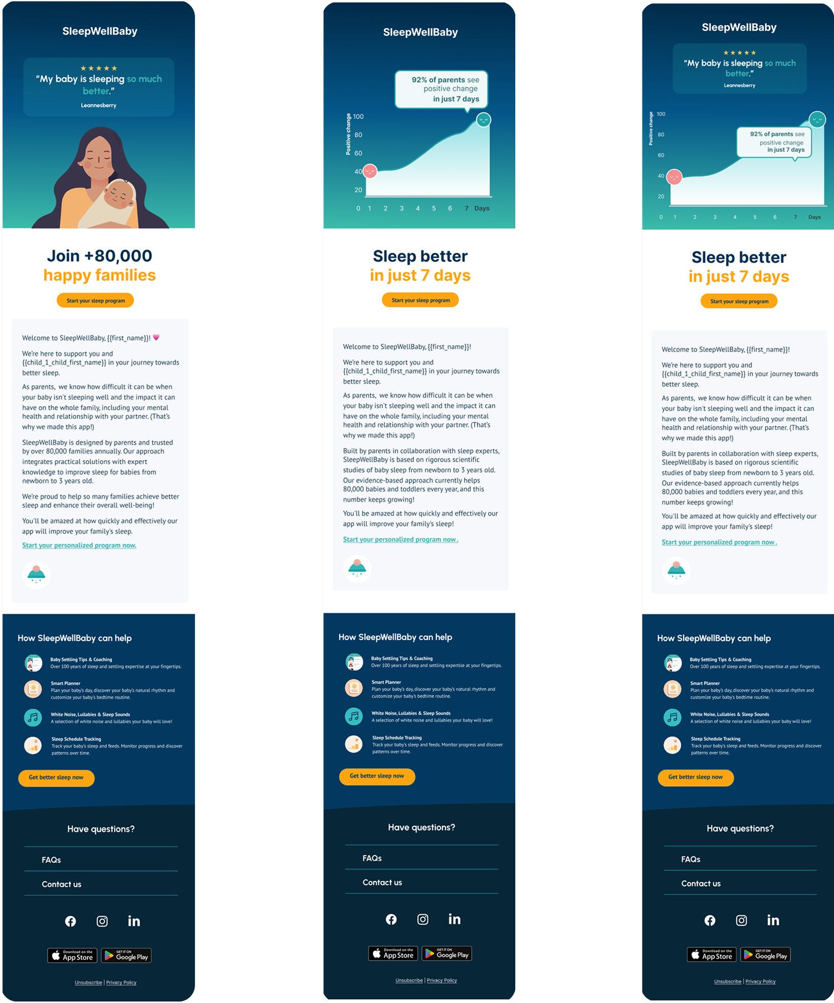
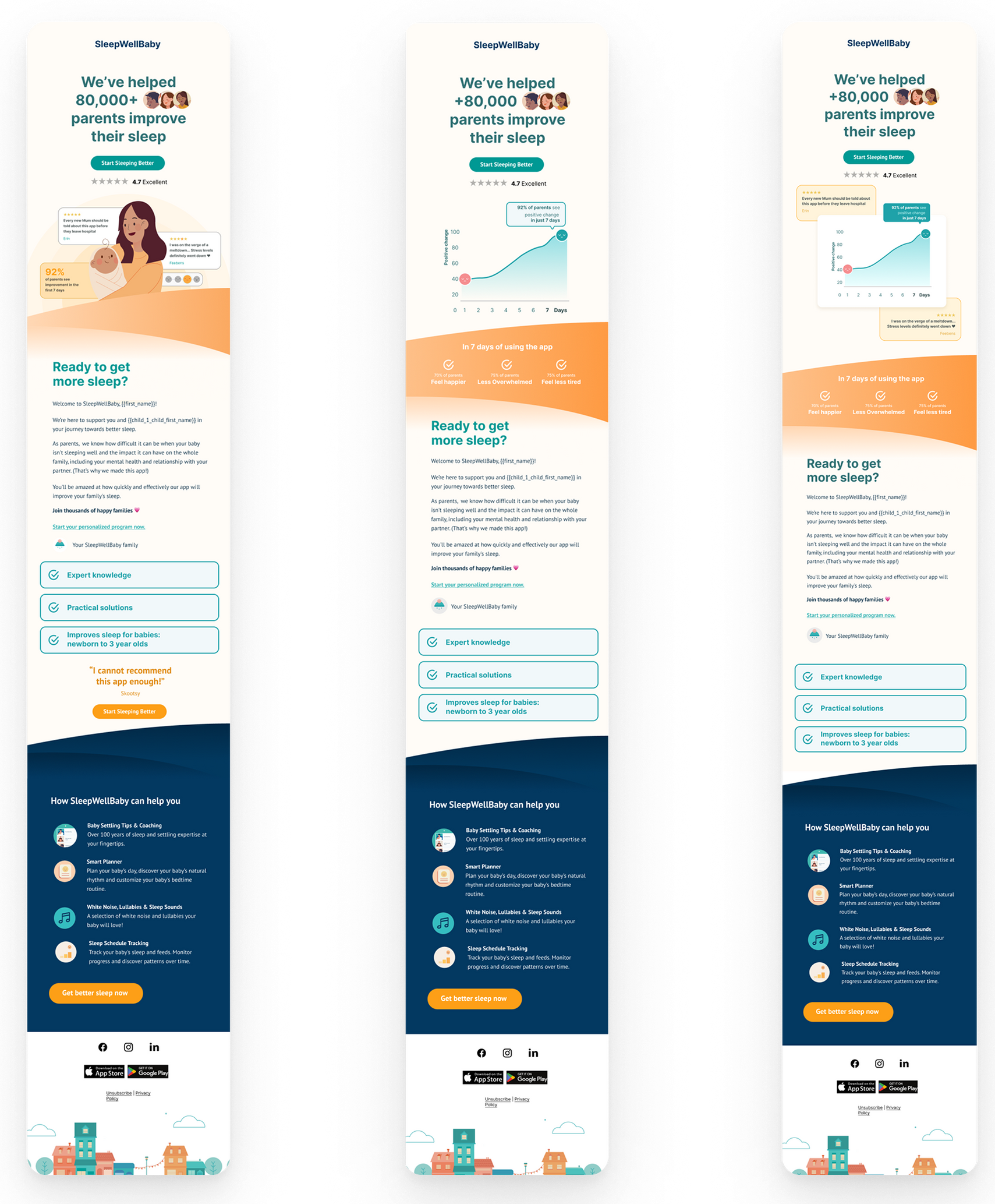
Keeping Our Users Engaged
EMAIL CUSTOMER ENGAGMENT AUTOMATION (CEA)
One of the ways that we reduced subscriber cancellations was through targeted engagement campaigns via email. For this, we created three main designs that had different ways of displaying information.
Social Proofing
Testimonial Focus
Science Proofing
Data Focus
Social + Science
Combination
Social Proofing
Testimonial Focus
Science Proofing
Data Focus
Social + Science
Combination
Social Proofing
Testimonial Focus
Science Proofing
Data Focus
Social + Science
Combination
AD DESIGN
Crafting High-Performance Campaigns for Every User Type
We launched performance marketing campaigns across Apple Search Ads (ASA), Meta, and Google Ads, with TikTok planned for phase two after initial learnings. Each marketing campaign was split into four categories to cater to the different user archetypes:
emotive, social proof, feature-led & science proof.
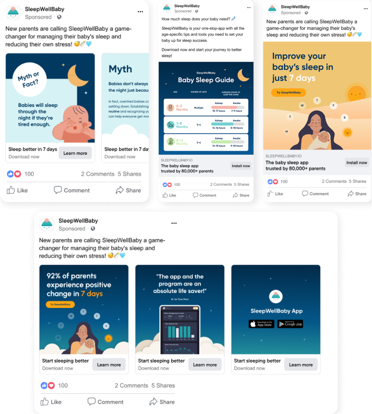
Emotive
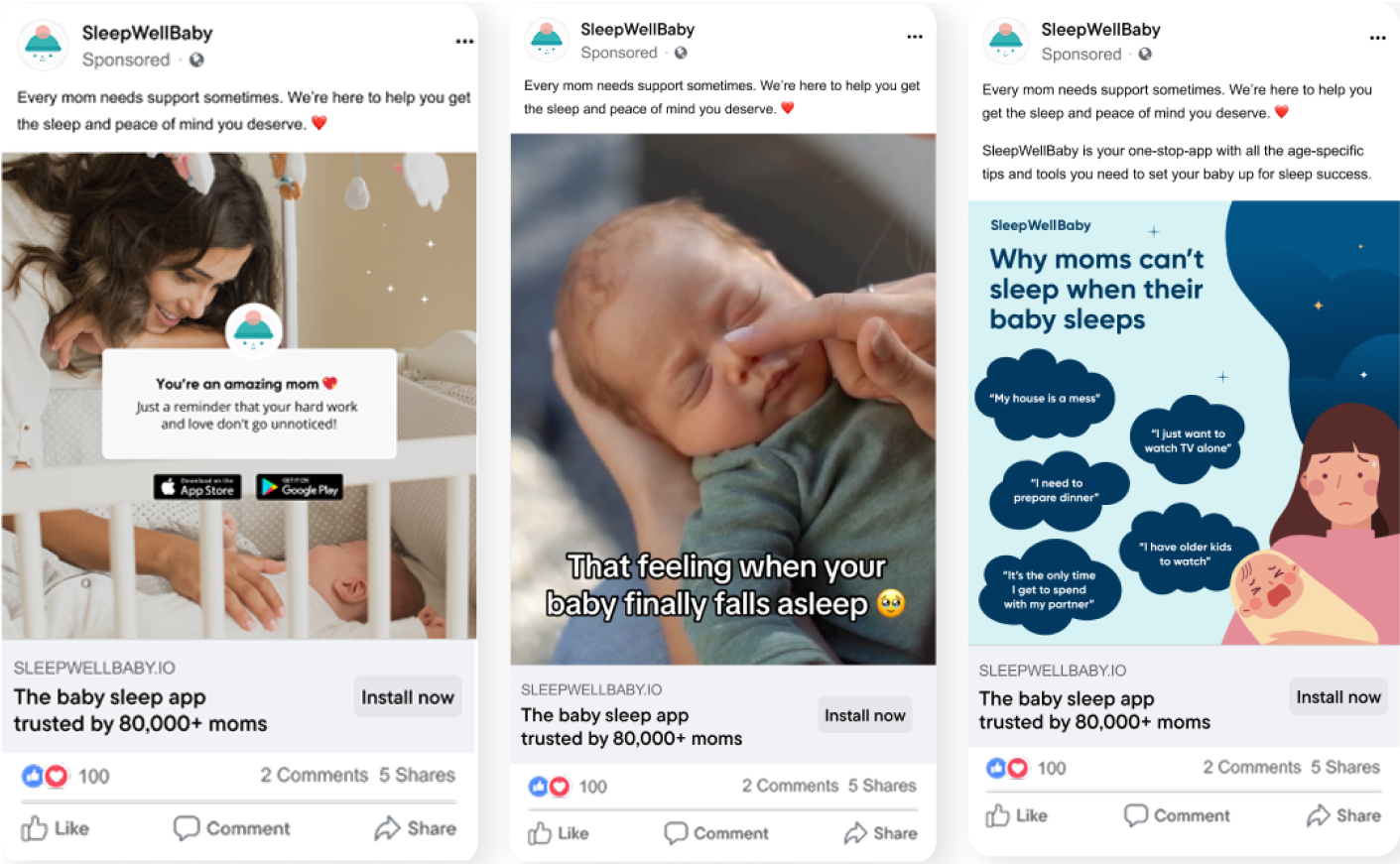
Social Proof
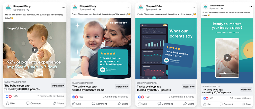
Future-Led
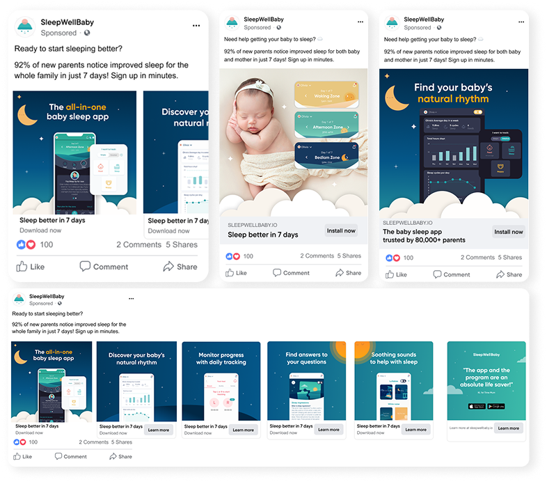
Science Proof
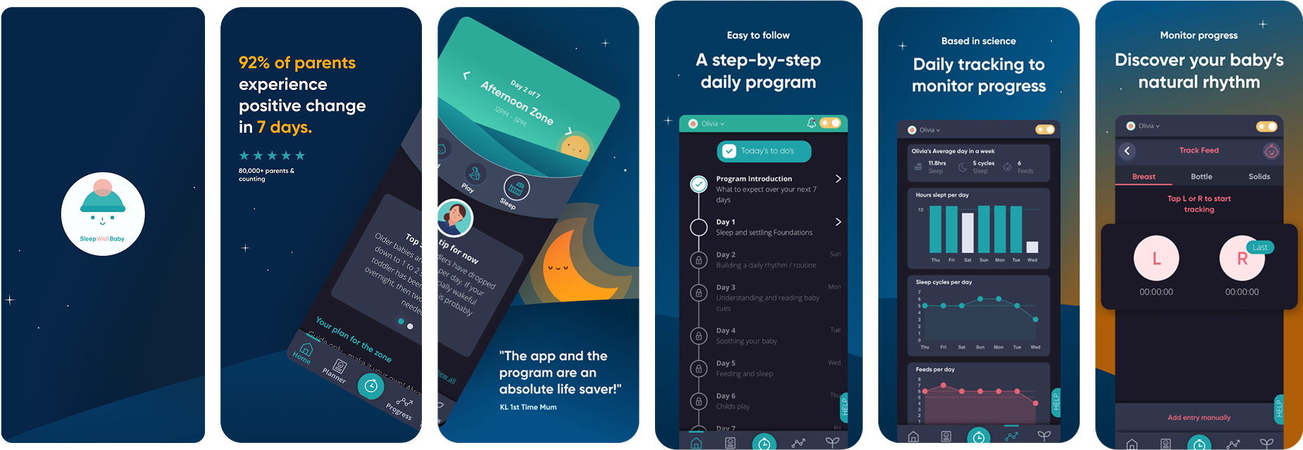
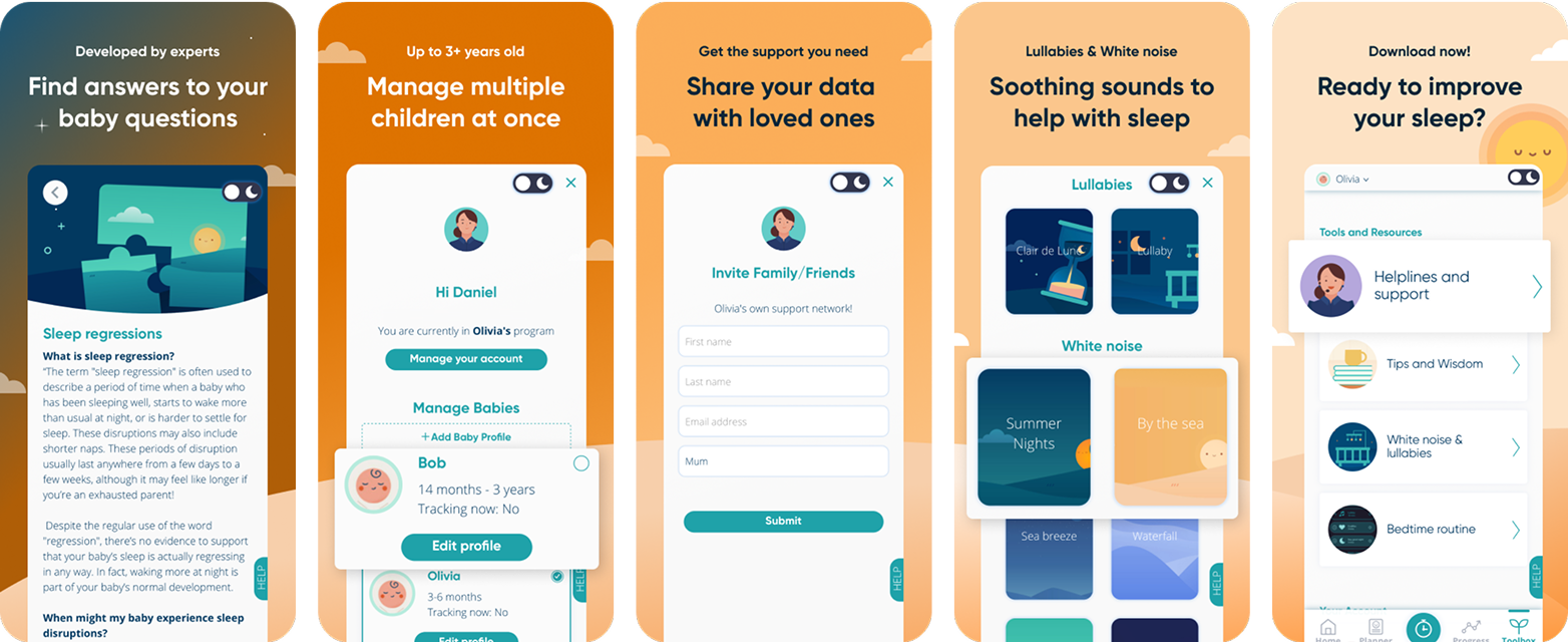
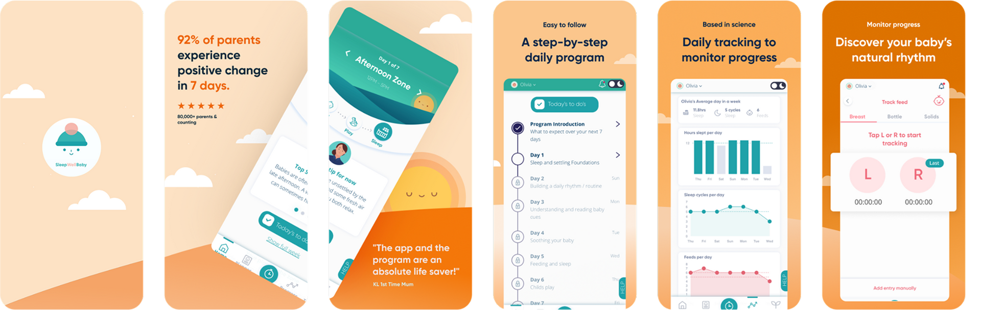
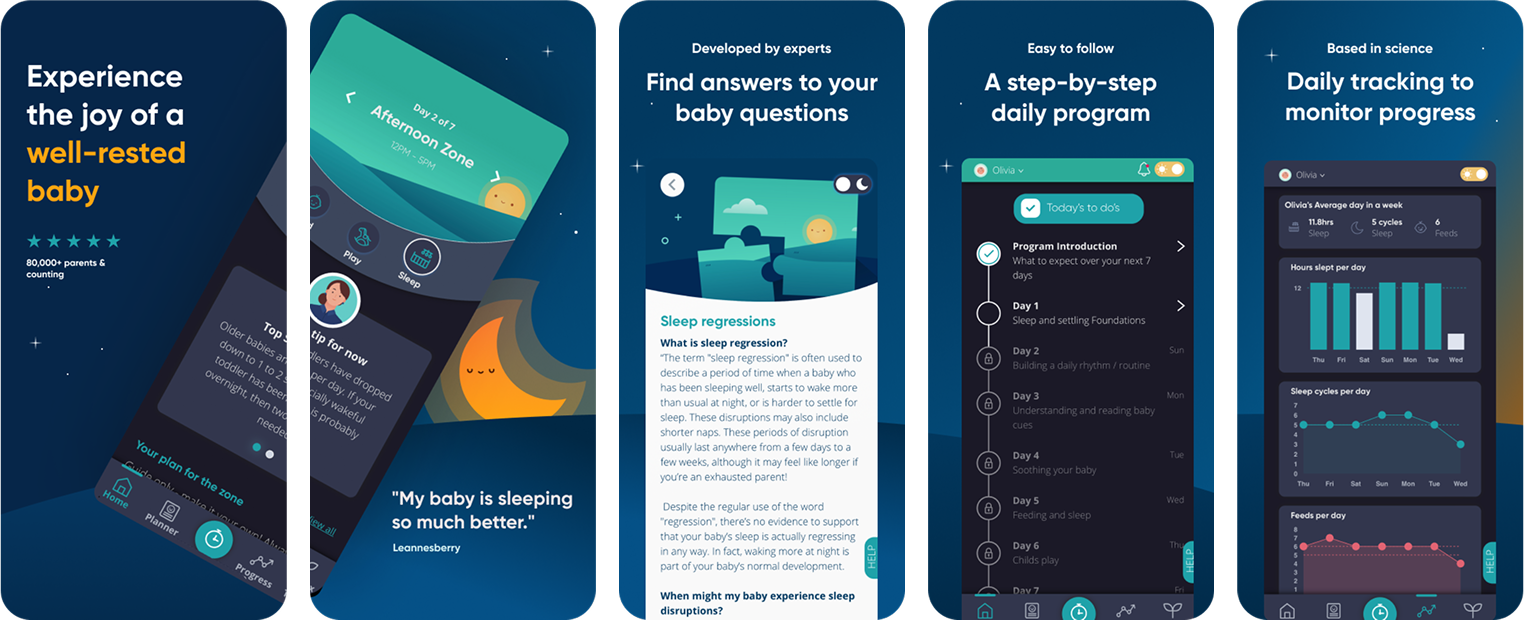
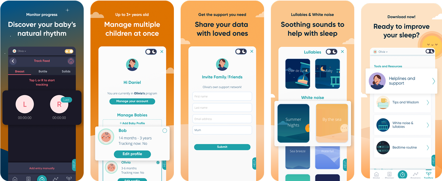
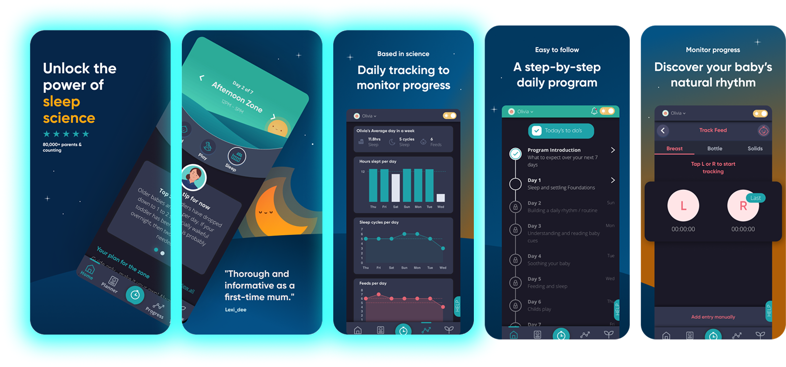
Overhauling App Store Optimisation
APP STORE OPTIMISATION (ASO) DESIGN
We overhauled App Store Optimisation (ASO) to improve both discoverability and conversion rates. One of the ways we were able to achieve this was through redesigning the App Store and Play Store pages and crafting engaging screenshot captions. This included designing 4 creative variants for testing and revamping the video to align with the new design.
Social Proof (Dark)
Social Proof (Light)
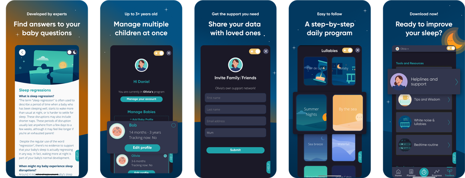
Emotive
Feature/Science Led
Ready to Grow?
Get in touch to book in a call, and make sure to check out our case studies showcasing some of our recent impact!