
Redesigning Energy Habits
Making energy insights clearer, actions simpler, and habits stickier—turning everyday users into energy-savvy pros

"Working with Matt and the team at Growth For Purpose has been a game changer. Their strategic thinking, attention to detail, and deep understanding of the psychology behind product design helped us bring clarity and structure to a complex project.
They didn’t just deliver beautiful, thoughtful UX - they brought insight, energy, and a clear path to growth. Matt’s depth of knowledge and the team’s collaborative style made the whole process feel seamless.
Highly recommend for any product team serious about impact."
- Oscar Omegna, Founder

VoltaRocks
Client
Year
2025
Background
VoltaRocks is a free app designed to help Aussie households take control of their energy. It shows where you're using power, helps you switch to better energy plans, unlocks rebates, and gives smart tips for going electric.
Key Goals
- Lower cognitive load and improve user engagement throughout the app
- Deliver generous value through quick-win responses in the onboarding process
Our Role
We apply habit-changing psychology to drive and boost performance across key metrics from acquisition to retention, while strengthening VoltaRocks’ ability to help Australians take control of their energy.
Note: Designs have been published with the client's permission.
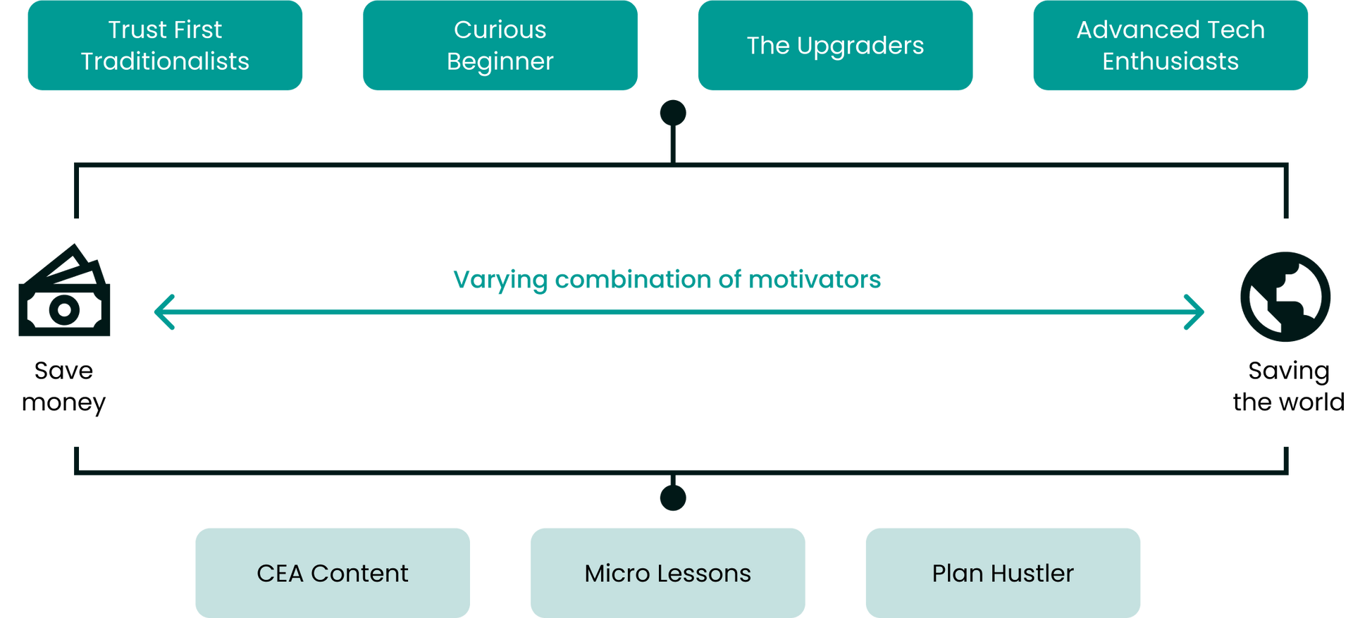
TARGET AUDIENCE
Designing for All Users
VoltaRocks caters to a diverse user base, from those keen on saving money to eco-conscious individuals aiming to reduce their carbon footprint. By understanding and mapping these varied motivations, we've crafted an experience that resonates with all users, guiding them toward meaningful energy-saving actions.
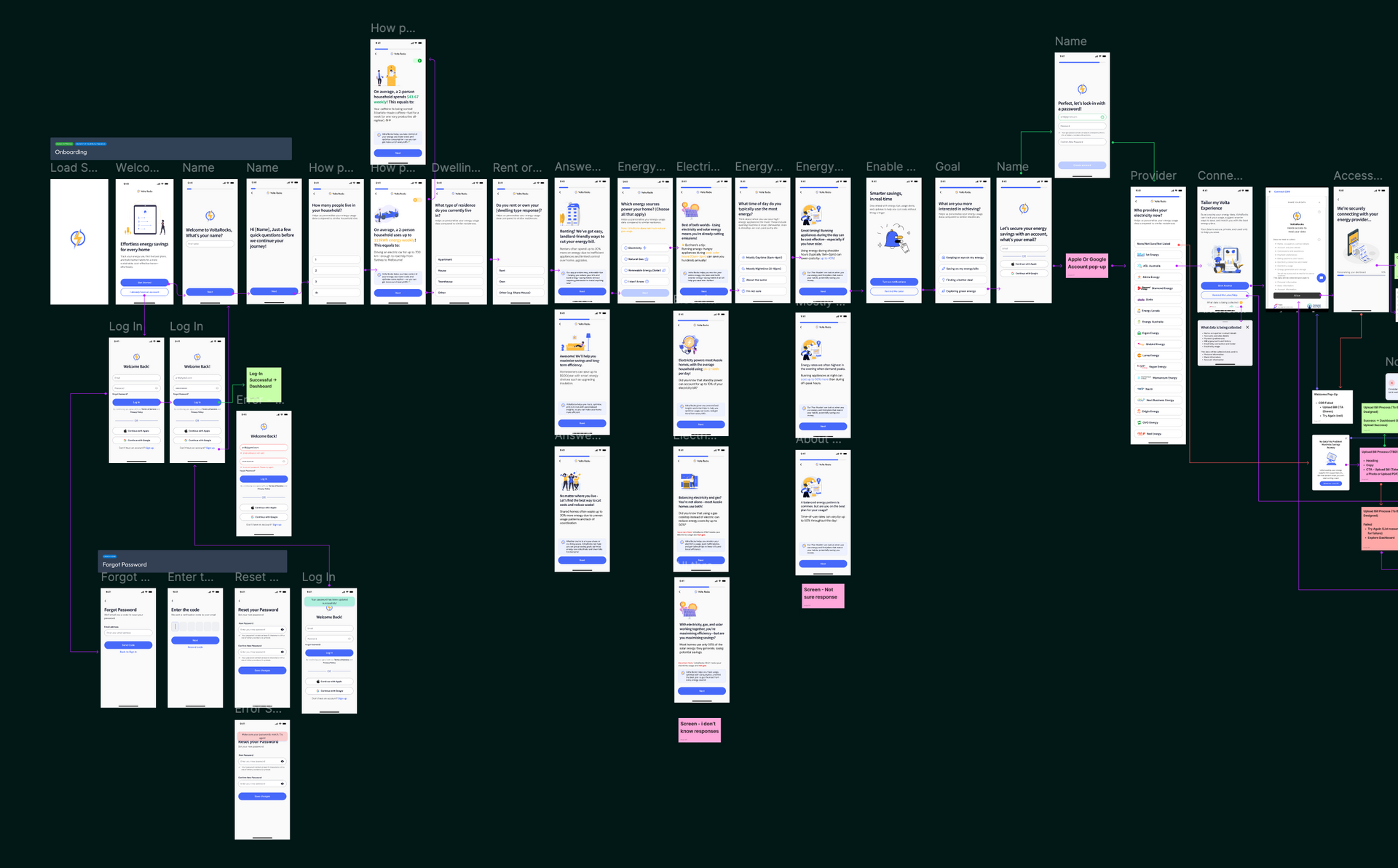
ONBOARDING
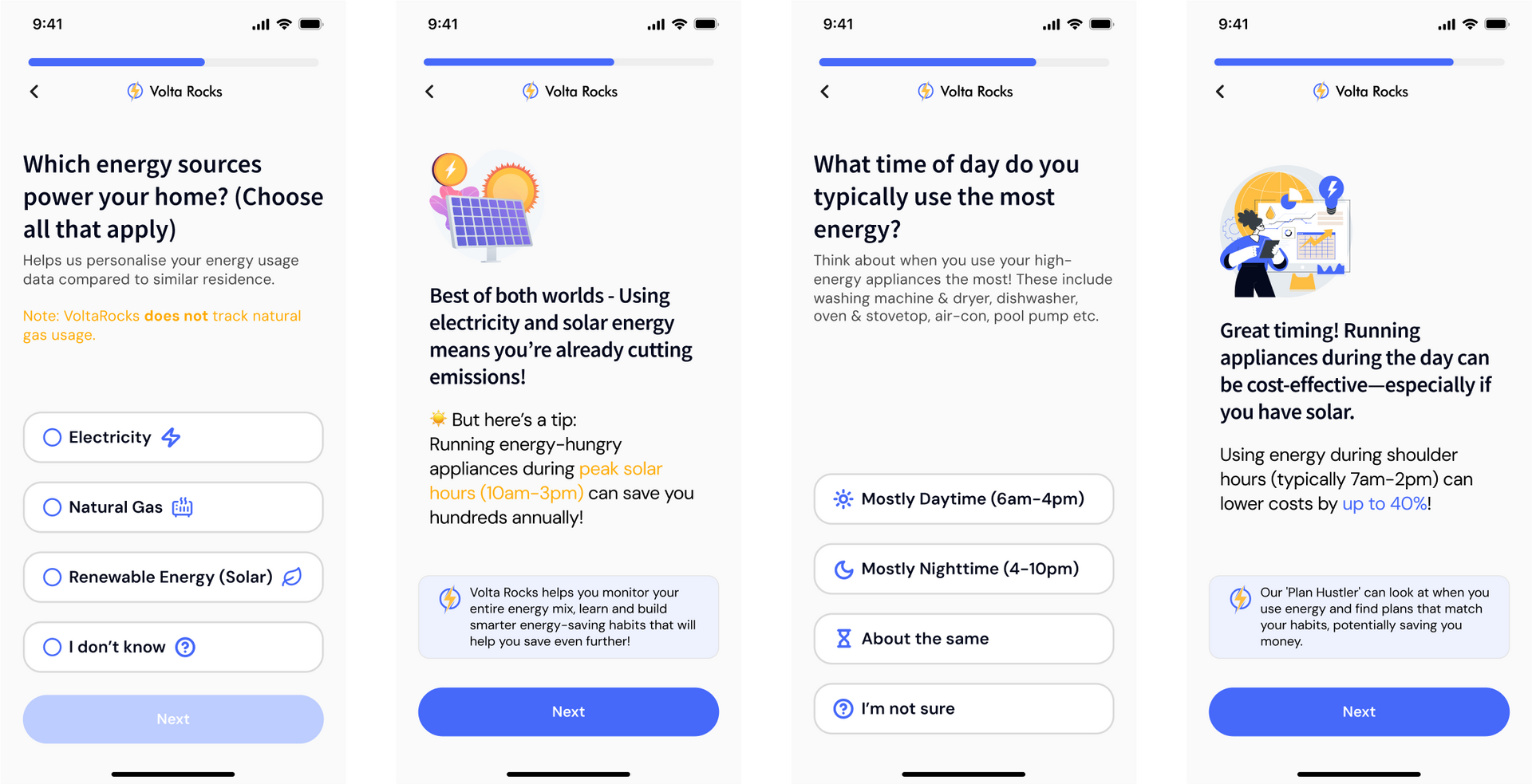
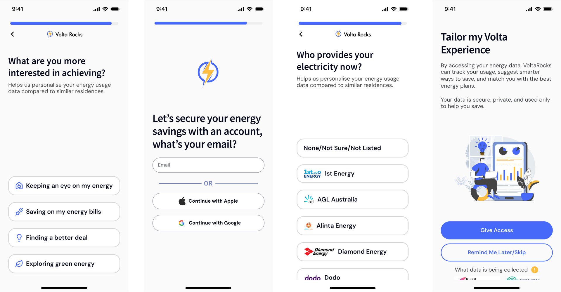
From the Start
Goal: To deliver an engaging and value-adding initial experience for all types of users
We designed and developed
a quiz-based onboarding journey that encourages users to invest their time and attention through interactive questions and value-driven responses that demonstrate how Volta can help. As users progress, they
receive personalised tips and insights based on their answers—sparking curiosity, building anticipation, and
keeping them motivated to complete the experience.
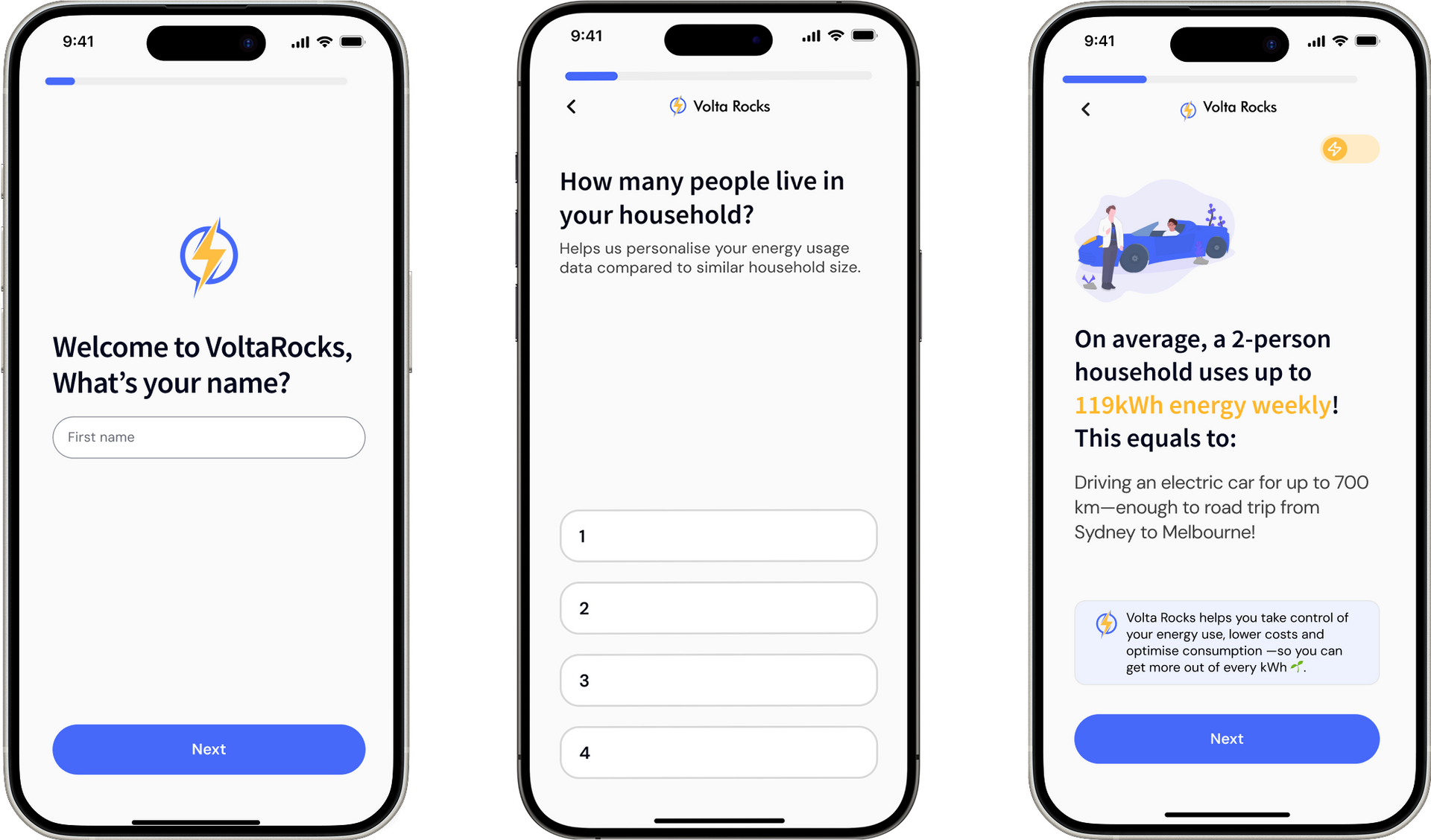
Keeping Users Engaged Every Step of the Way
As users progress through the journey, the progress bar at the top of the screen reinforces their investment of time, making them less likely to abandon the experience. Engaging copy that uses conversational language—combined with a compliment, a quick tip, and a clear highlight of how Volta adds value—helps boost both acquisition and retention of new users.
Final Steps
As users near the end of the onboarding journey, they’re prompted to select a personal goal (tapping into intrinsic motivation), secure their account, and choose their preferred onboarding experience. If their energy provider appears in the dropdown list, they’re seamlessly directed to the final screen shown here.
Building Trust
VoltaRocks builds user trust by clearly communicating what data will be collected—accessible via an information icon—and by transparently highlighting the benefits of connecting their CDR. Importantly, users are given the option to connect their data later, which increases trust by offering flexibility and control.
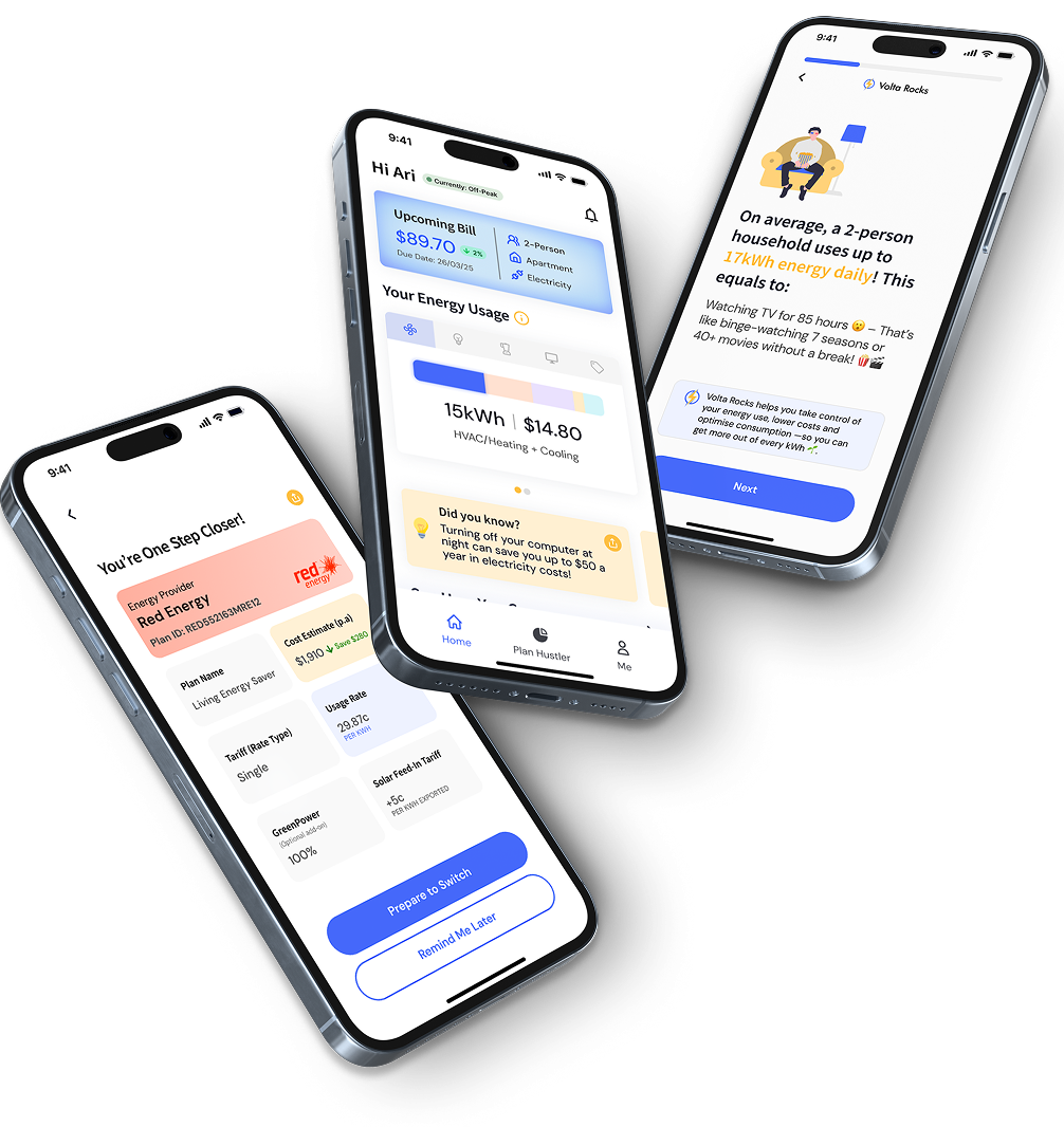
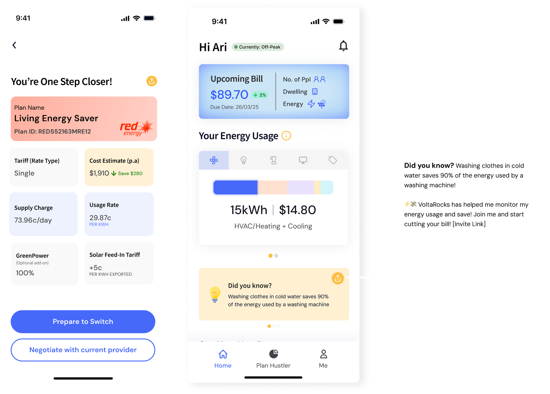
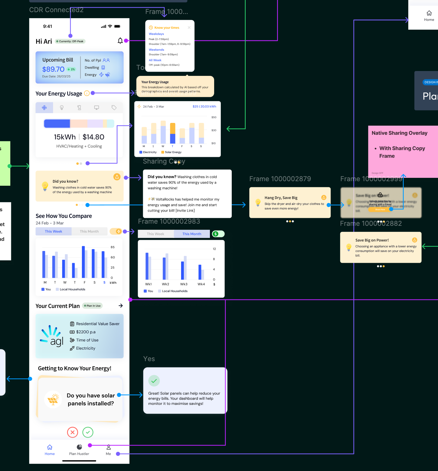
DASHBOARD
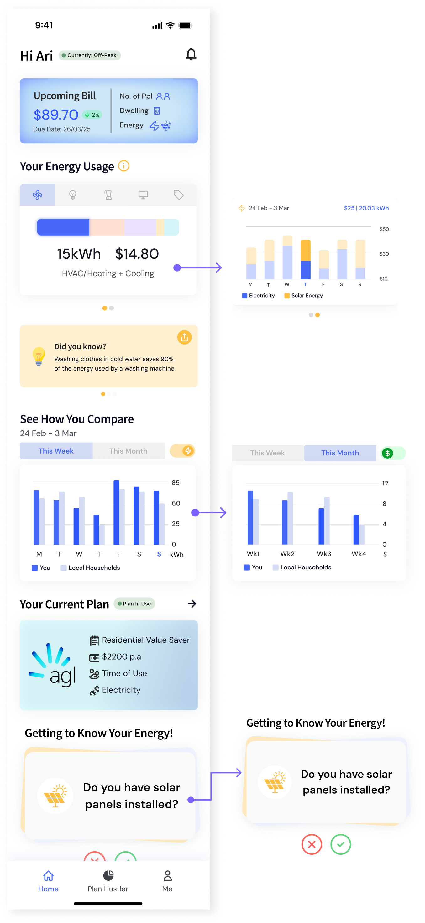
Building Energy Habits with The New Home Base
Goal: To lower cognitive load and friction for all users providing an intuitive in-app experience without the learning curve
Users are subject to a value-adding experience from the start with their energy usage all the way down to displaying their plan details and a flashcards module. Through visual hierarchy, the most important information is displayed at the top where users can easily understand and track their process and energy usage.
Micro-Rewards
Placing the upcoming bill at the top—and highlighting
the 2% drop—shows users they've successfully reduced their energy use. This positive reinforcement
motivates them to keep checking the app, creating a habit loop that builds long-term engagement.
Social Comparison
Users are able to
compare their energy usage against other households in their area with similar backgrounds e.g. 2 people, living in an apartment. This creates
friendly competition and motivation as to decrease their energy usage.
Micro-Learning
Through the use of flashcards, users are able to interact and receive tips, facts and actionable steps in reducing their energy usage and this lowering their bill. This also allows Volta to further personalise the user’s experience and
keeping them engaged with the app.
ONBOARDING
Designing for Zero Data: Guiding Users to Unlock the Full Experience
Not every user can connect their data right away - when a user’s provider isn’t supported by CDR or they chose to skip if their provider is supported, their journey may feel disrupted. To combat this, we designed a new dashboard state (without CDR connected) to turn this moment
into a clear, low-friction step - prompting users to upload their latest energy bill so they can continue their energy journey
without disruption.
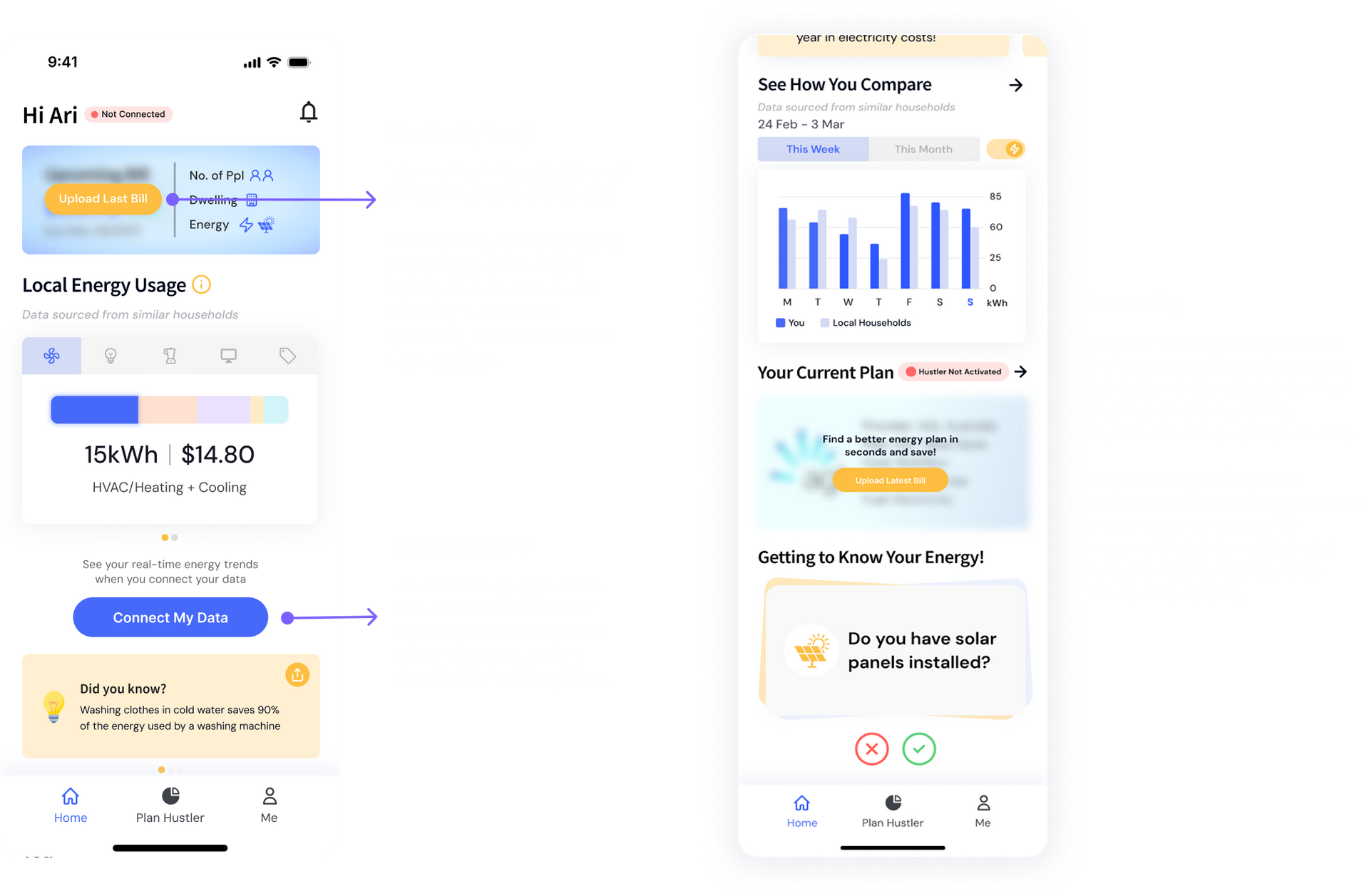
Designing for Every State
The VoltaRocks dashboard was built to support users at every stage of their energy journey—even when data is missing, delayed, or in transit. We designed distinct states to keep the experience transparent, consistent, and motivating.
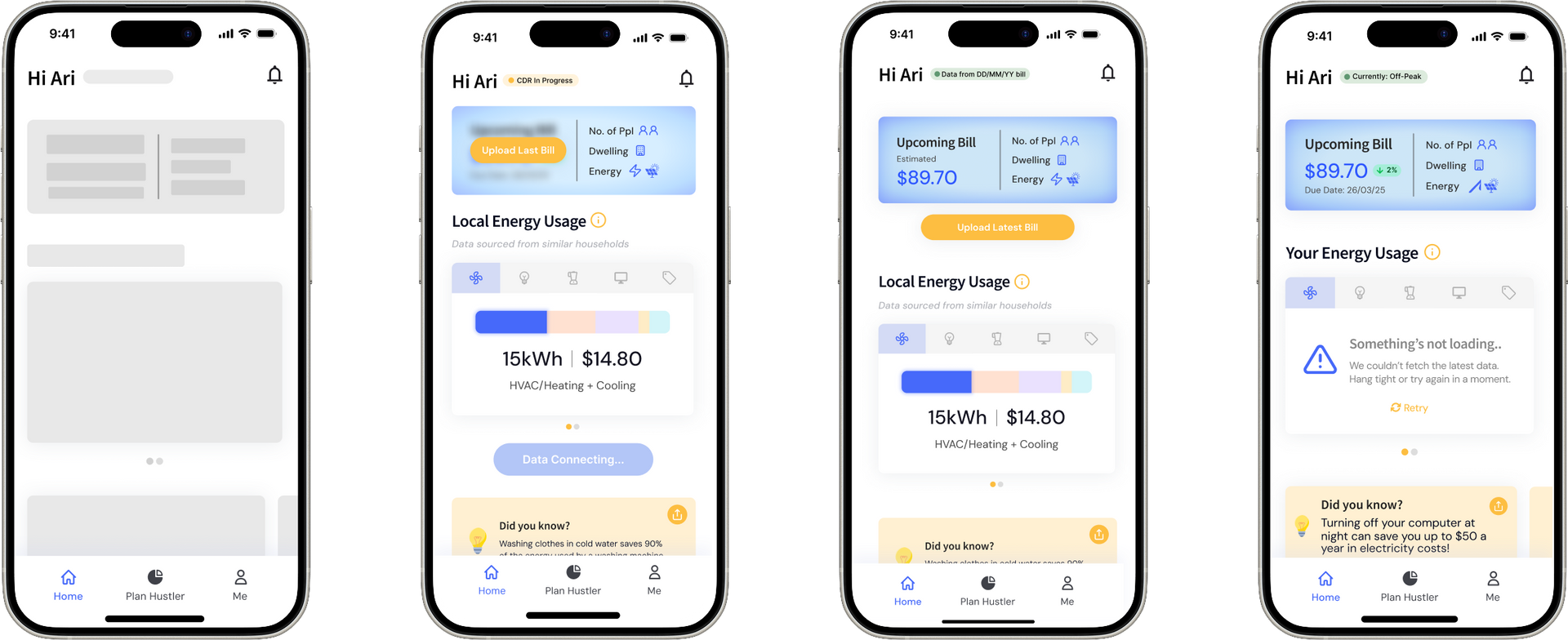
Figure 1.0 - Loading Skeleton
While data is being fetched, a minimal skeleton layout sets expectations and avoids visual jank—helping users feel the app is responsive, not broken.
Figure 1.1 - CDR In Progress
When CDR connection is underway, we show real-time feedback and encourage users to upload their bill as a fallback—so progress doesn’t stall.
Figure 1.2 - Bill Upload Success
Once a bill is uploaded, users immediately see estimated costs and usage benchmarks. This moment delivers value upfront and nudges users toward regular engagement.
Figure 1.3 - Error State
If something goes wrong, we inform users gently and clearly, offering a retry option and helpful tips. The goal: reduce frustration and keep trust intact.
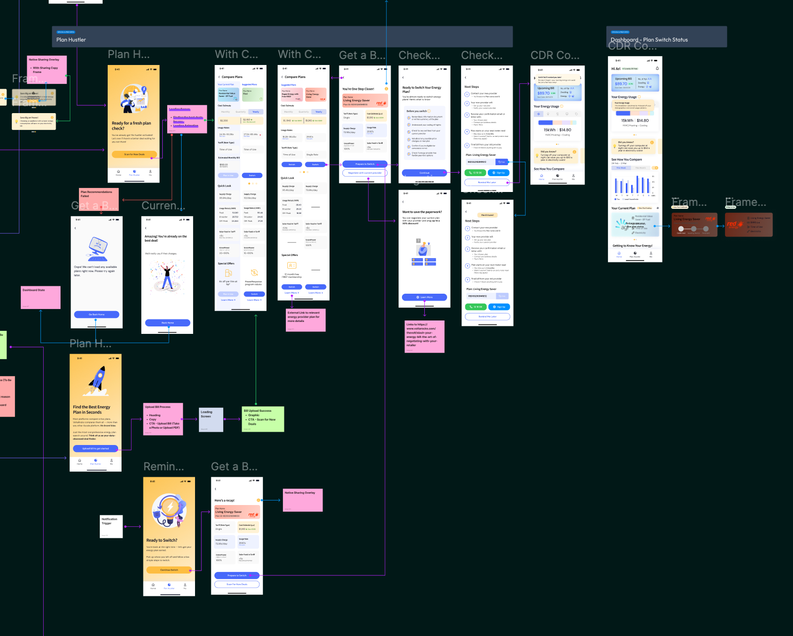
PLAN HUSTLER
Helping Users Hustle for a Better Energy Plan
Goal: To remove friction, build trust, and empower users to take control of their energy costs in just a few taps.
Finding the right energy plan is often confusing and time-consuming. With Volta’s Plan Hustler feature, we set out to simplify that process—helping users compare plans quickly, understand their savings, and switch with confidence.
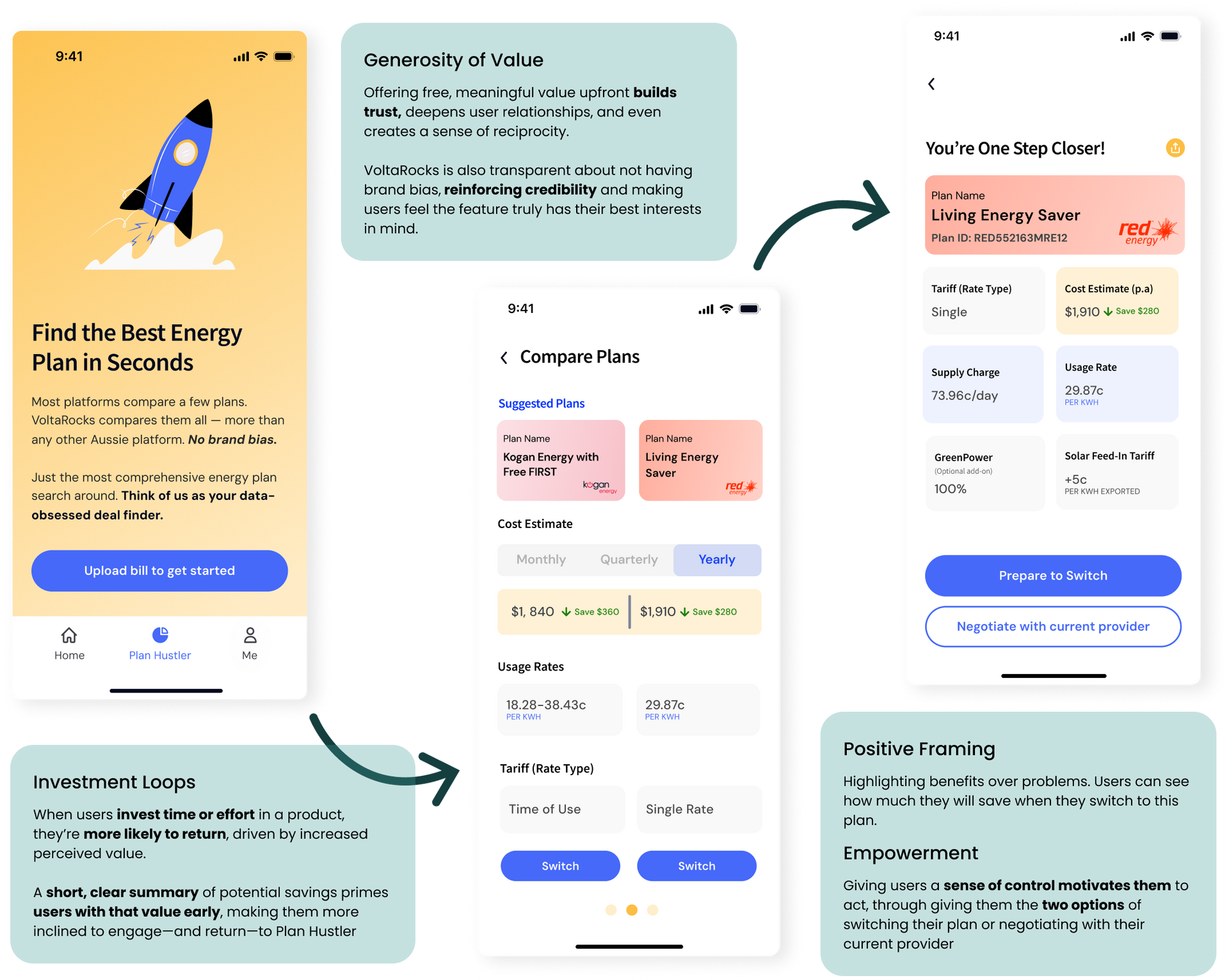
Making the Switch Seamless
Once users find a better plan, the experience doesn't stop there. We designed switching journey to feel simple, supportive, and stress-free -eliminating common barriers like confusing jargon, unclear steps, and long wait times.
From start to finish, users are guided through exactly what to expect.
Clear next steps, timely reminders, and upfront transparency make the process easy to follow and instill confidence at every stage.
Each touchpoint is thoughtfully designed to build trust and maintain momentum. With proactive nudges, instant access to key plan details, and real-time dashboard updates, users stay informed, empowered, and fully in control from switch to success.

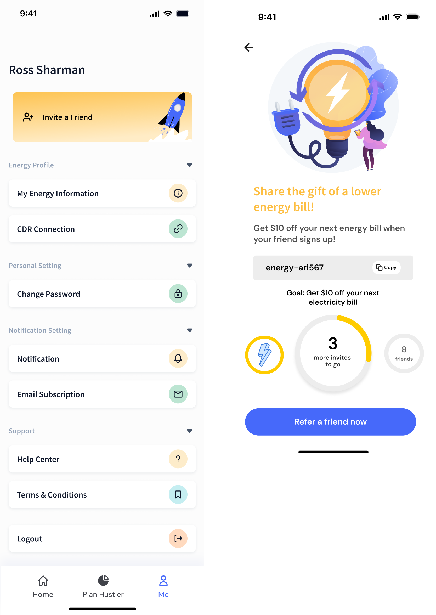
Driving Growth Through Shareable Moments
SOCIAL SHARING
Goal: To drive user acquisition and growth through social sharing strategies
We applied three immediate quick win strategies to key screens during this first phase. This includes IAM (In-App Messages) share prompts, sharing content and inviting friends via a prominent CTA button.
IAM Share Prompts (When App is Opened)
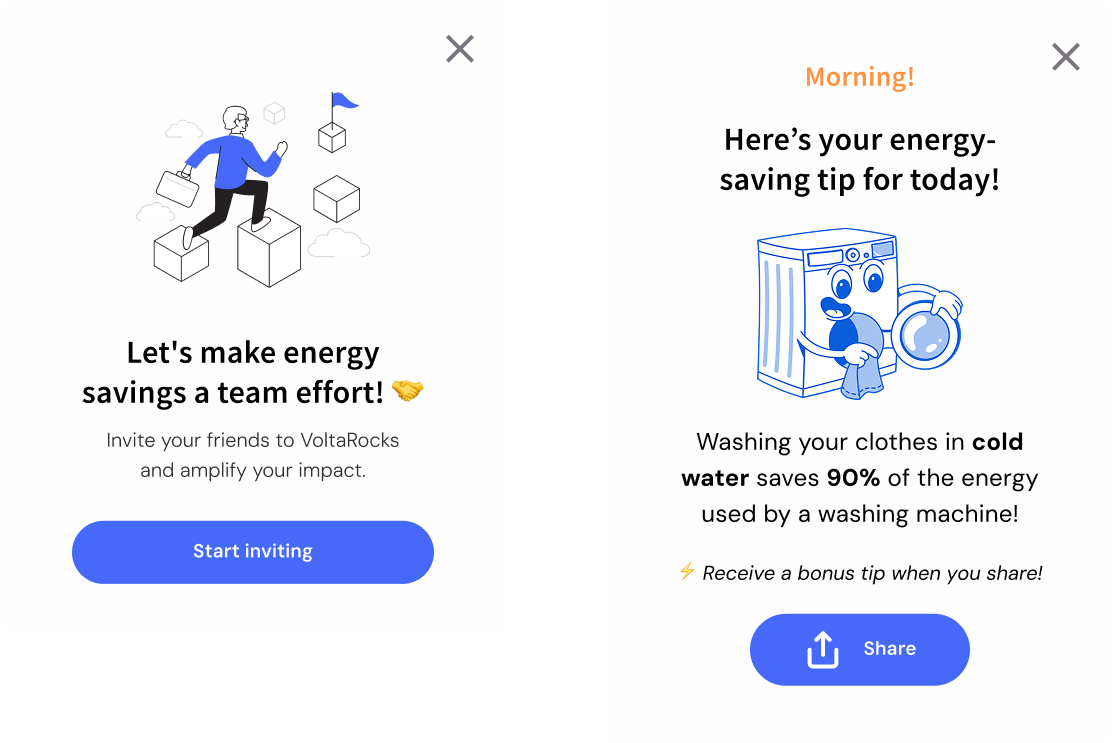
UI/UX (Prominent Share Button)
Inviting Friends
GLOBAL STATES
Designing for Every Scenario
Like every digital experience, you never know what will happen from offline and loading errors to server and maintenance updates. This is why we’ve designed for three different global states: Offline, Plan Hustler is Down, Error.
Each with their own different variants.
Offline
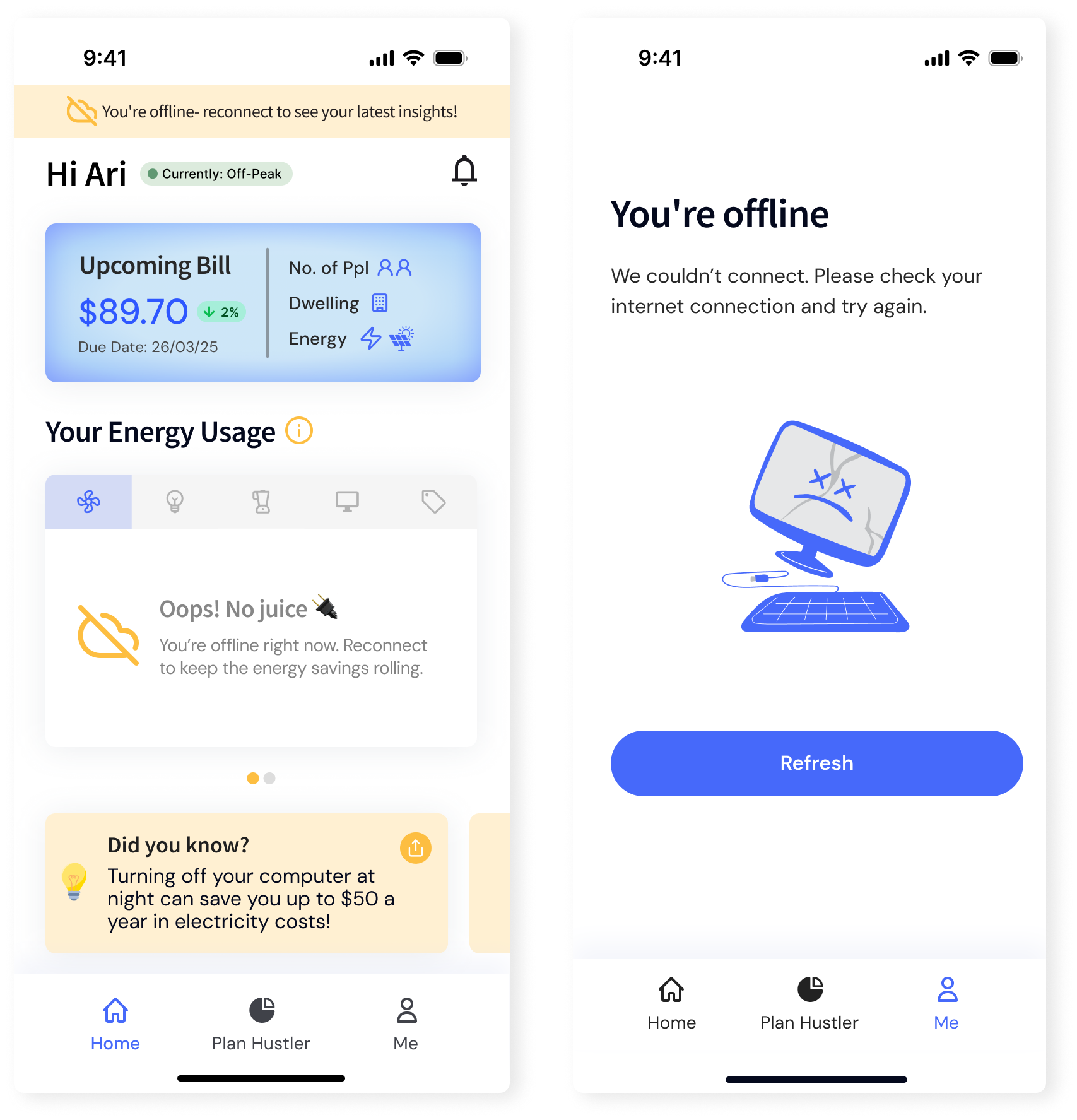
Plan Hustler is Down

Error

Mapping Out the Whole Journey
USER JOURNEY MAP
To wrap up the end of the phase, we mapped out a whole user journey from onboarding, switching plans to potential error states. By zooming out and considering all the possible flows that a user may take, we designed not just the screens but meaningful and seamless app experience.
Onboarding
Dashboard
Plan Hustler
Ready to Grow?
Get in touch to book in a call, and make sure to check out our case studies showcasing some of our recent impact!